How To Increase Conversions With This 6-Step Customer Journey Analysis
Let’s be honest: when sales dip, our first instinct is “run more ads.” Most of the time, you don’t need more traffic; you need a cleaner path for the people already knocking at your door. This is where a 6-Step Customer Journey Analysis feels like magic. It’s calm, practical, and human. You look at what real people see, feel, and stumble on from first click to coming back again, and you fix the leaks one by one.
Below is a warm, no-jargon walkthrough you can run in a week, even with a small team.
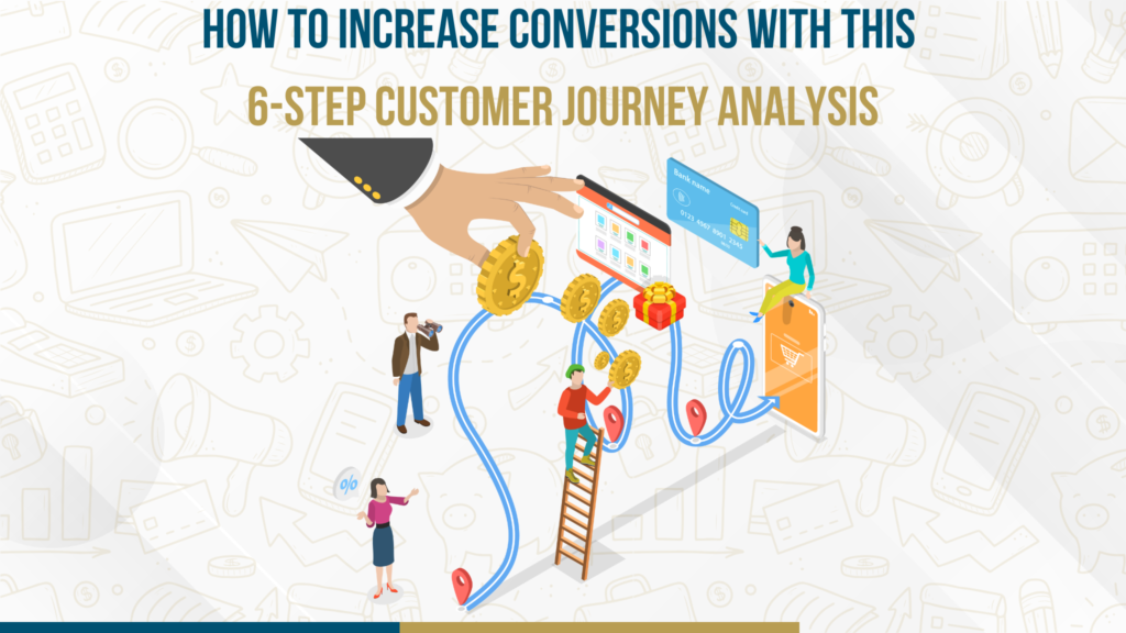
Learn how a 6-step customer journey analysis helps increase conversions and improve your overall marketing performance.
What does “6-step customer journey analysis” mean in real life
A journey is simply the chain of moments your customer goes through:
Awareness → Consideration → Conversion → Onboarding (First Value) → Retention → Advocacy
Think of it like guiding a friend through your city. You don’t shout directions from far away—you walk with them, remove confusion, and point out the shortcuts. That’s your job as a marketer: reduce friction, increase confidence.
Before Read: Avoid Google Backlist: 8 Must-Know Website Safety Tips
Step 1: Map the journey on one page (not a fancy doc)
Grab a notepad or a Miro board and write the six stages across the top. Under each, list the real touchpoints:
- Awareness: Google Ads, Instagram post, a friend’s referral, a review site
- Consideration: Landing page, pricing page, product pages, comparison blog
- Conversion: Checkout or lead form, payment, confirmation page
- Onboarding: Welcome email, quick tutorial, first setup
- Retention: Replenishment reminder, product tips, new feature email
- Advocacy: Review request, referral link, loyalty perk
Now add a one-line goal for each stage. Example:
- Consideration → “Click the main CTA.”
- Conversion → “Finish purchase or book a call.”
- Onboarding → “Reach first success in < 24 hours.”
Finally, jot down friction guesses. “Headline doesn’t match ad promise,” “Shipping cost appears at the end,” “Trial starts but nobody knows what to do,” etc. This single page will guide your week.
Step 2: Pull a few useful metrics (not all of them)
You don’t need a data lake. Start with GA4 + a heatmap/replay tool.
- Awareness/Consideration: CTR, qualified sessions (time on page/scroll depth), bounce, time to first interaction
- Conversion: Add-to-Cart or CTA clicks, form errors, checkout abandonment, load time
- Onboarding: % who complete the one big “aha” action, time-to-value
- Retention/Advocacy: Repeat purchase rate, DAU/WAU/MAU, churn reasons, NPS/reviews
If a metric doesn’t affect a stage’s goal, ignore it this round. Focus is kindness.
Step 3: Find one big leak (the nearest to money)
Make a simple funnel from the last 30–90 days:
- Qualified session → CTA click
- CTA click → Purchase/Booked call
- New customer → First success (onboarding)
- Active user → Repeat purchase / Month-2 usage
Pick the worst step. Example: If many users click “Add to Cart” but few pay, you have a checkout problem, not an ads problem. Fixing the nearest bottleneck to revenue is how you get quick, confident wins.
Ready to sell nationwide? Get a conversion-focused e-commerce website solution.
Step 4: Watch people use your site (10–20 replays)
This is where the analysis gets human.
- Mismatch moments: Ad says “2-day delivery,” PDP hides shipping details. People get spooked and leave.
- Friction moments: Long forms, tiny fonts on mobile, confusing coupon fields, surprise fees at the last step.
- Lost moments: Users scroll and scroll—no clear CTA, no proof, no return policy where they need it.
As you watch, capture specifics: screenshot, timestamp, “what they expected vs. what happened.” Evidence turns debates into decisions.
Step 5: Prioritize with ICE (Impact, Confidence, Effort)
Score each idea from 1–10:
- Impact: If this works, how big is the lift?
- Confidence: Do we have proof (data, replays) that this will help?
- Effort: Lower effort = higher score (we want quick wins first)
Example fixes and scores
- Show delivery ETA + total price above the fold on product pages → I:8 C:7 E:9 = 24
- Compress images and lazy-load below-the-fold → I:6 C:8 E:8 = 22
- Reduce checkout from 4 steps to 2 → I:9 C:6 E:5 = 20
- Replace vague headline with benefit + proof → I:7 C:7 E:8 = 22
Sort by score. Ship 2–3 items this week. Small, obvious, high-impact fixes beat giant projects you never finish.
Step 6: Test → Learn → Roll out (keep the loop gentle)
- One hypothesis at a time:
“Because total cost is hidden until checkout, people abandon. Showing total cost + ETA above the fold will lift ‘Add to Cart’ by 15%.” - Run A/B or sequential tests:
If traffic is low, do sequential: run Variant A for two weeks, then switch to Variant B. - Track the right metric:
Celebrate purchases/leads, not vanity clicks. - Write it down:
Keep a tiny log: hypothesis → change → result → lesson → next step. In a month, you’ll have your own playbook
Journey quick-wins you can ship today
Awareness → Consideration
- Make your landing headline match the ad word-for-word. Promise consistency builds trust.
- Add a 3-point benefit bar (what changes for the user), not features.
Consideration → Conversion intent
- Place trust elements near the CTAs: reviews, badges, delivery timelines, and refund policy.
- Add a small comparison block (“Us vs Alternatives”) so people don’t have to Google away.
Conversion
- Show total price + ETA early.
- Offer guest checkout and multiple payment options.
- Remove non-essential fields; auto-apply coupons if you promote them.
Onboarding (First Value)
- Pick one activation action (import a file, connect a tool, place the first order).
- Add a 3-step checklist and a 60-second micro-tutorial.
- Send behavior-based emails: “You created a project—invite your teammate next.”
Retention
- Replenishment or win-back emails that feel like help, not nagging.
- Teach people how to get more value (short how-to tips, not long manuals).
Advocacy
- Ask for reviews right after a good moment (delivery, first success).
- Make the referral link ridiculously easy to find and share.
A simple story (service business)
A consulting studio ran ads promising a “15-minute free audit.” On the landing page, the only CTA was a long “Contact Us” form. Replays showed people hesitating, scrolling, and leaving.
Fixes they shipped in 48 hours:
- Changed the CTA to “Book a 15-Minute Audit” and embedded a calendar.
- Added a three-step timeline under the hero: Book → Audit → Action Plan in 24 hrs.
- Put two proof snippets beside the form (client logos + one short quote).
Outcome (3 weeks): +26% click-to-call, +14% qualified leads. Same ads, smoother path.
Common questions (quick and human)
What if I don’t have enough traffic to A/B test?
Do sequential tests and usability interviews with 5–7 real users. Look for big, obvious signals, not tiny p-values.
How do I pick the “activation” event?
Choose the single action that most predicts long-term value (for SaaS: first import/integration; for e-com: first reorder; for services: first booked call).
How often should I repeat this analysis?
Monthly is great. Quarterly at a minimum. Also, refresh any time you change pricing, offers, or seasonality kicks in.
Which tools do I actually need?
GA4, one heatmap/session-replay tool, a testing tool (or a simple calendar for sequential tests), and a spreadsheet. Start simple.
Your 14-day plan (copy-paste to your team chat)
Days 1–2: Map the journey, define a goal per stage, and list 10 friction guesses.
Days 3–5: Pull funnel numbers; name the largest leak closest to revenue.
Days 6–7: Watch 20 user replays; write 8 evidence-backed fixes.
Days 8–9: Score with ICE; pick top 3 quick wins.
Days 10–12: Ship changes; QA tracking and mobile.
Days 13–14: Run an A/B or sequential test; log results and decide next steps.
By day 14, you’ll have fewer guesses, better pages, and a calmer pipeline.
The gentle truth
People don’t need more persuasion; they need fewer reasons to hesitate. A 6-Step Customer Journey Analysis is just mindful housekeeping: make the promise clear, remove the bumps, celebrate the small wins, and keep going. Conversions rise when the experience feels honest and easy, and your brand will feel more human because it is.